
Carlsberg
The Kobenhaven Collection
The Challenge:
Change brand perception and reconnect with the brand’s Danish roots.
The Solution:
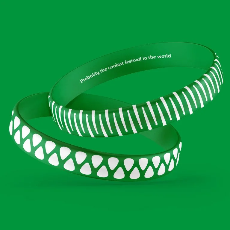
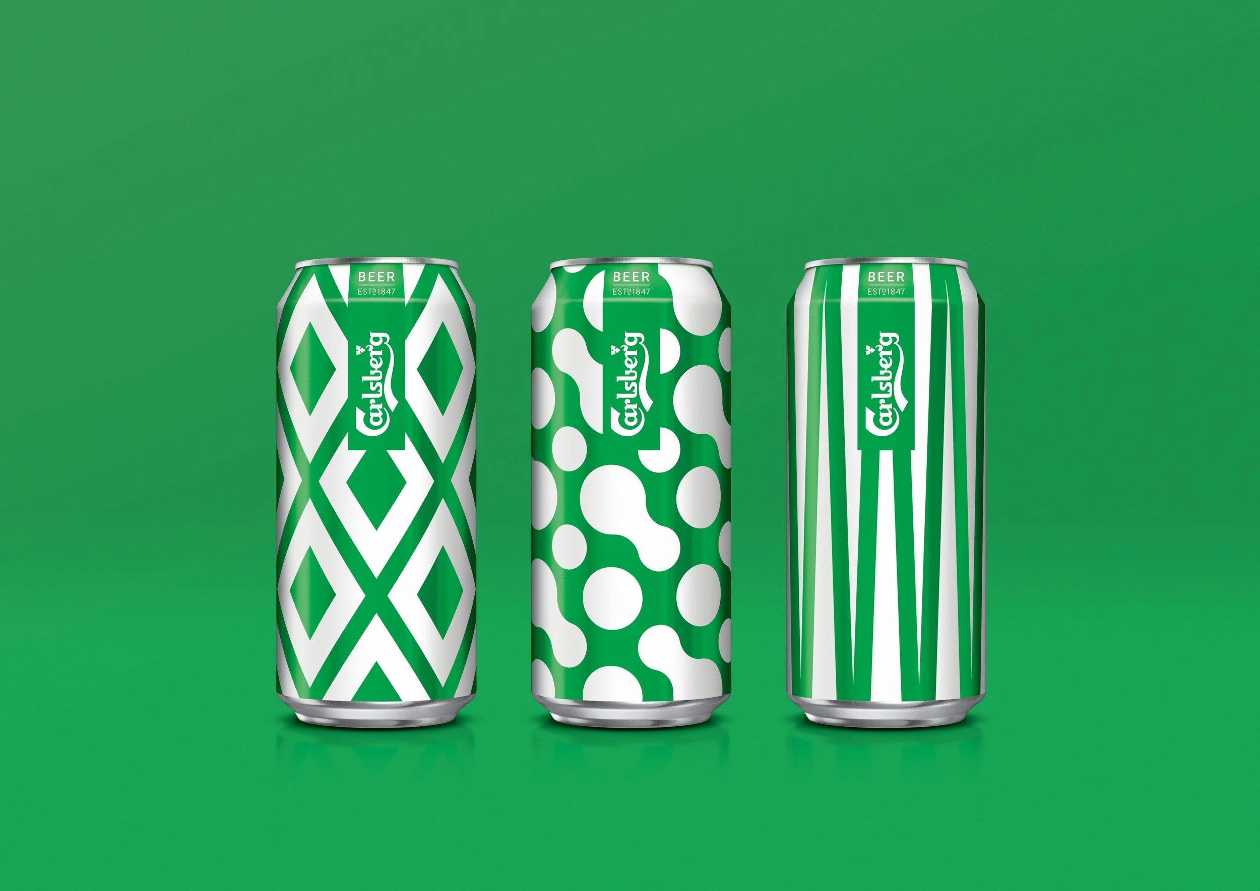
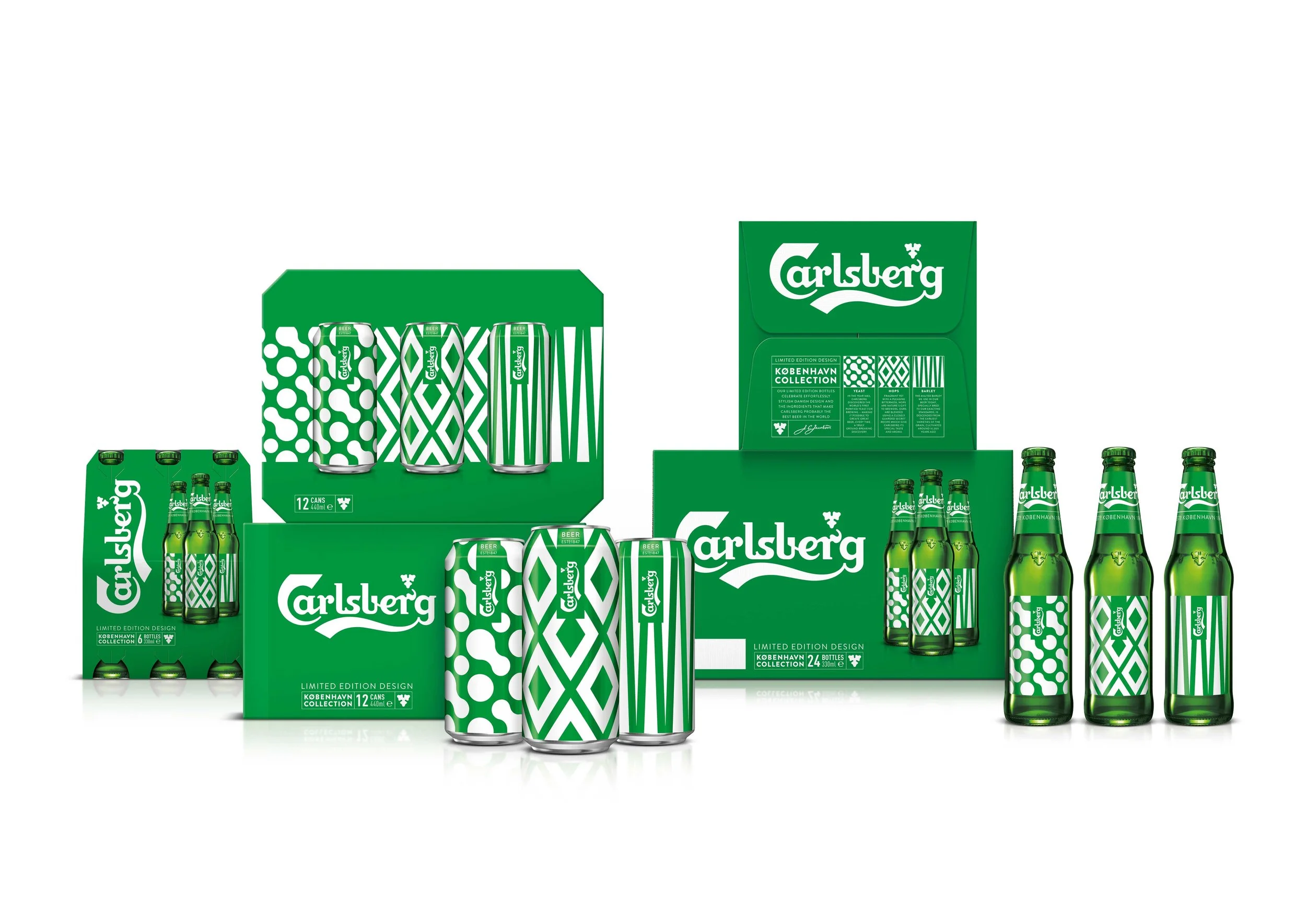
Limited edition packaging to reinforce Carlsberg UK’s new Danish-focused strategy. Borrowing from the beautiful simplicity of Danish design, each pack embodies an abstract interpretation of Carlsberg’s most iconic ingredients: beautiful barley, the mighty hop and Carlsberg’s legendary brewers’ yeast, which is the basis of the majority of today’s lagers.
Info:
Client: Carlsberg UK
Designed: January 2017
Agency: Taxi Studio
My Role: Creative concepts and design development
Deliverables: Packaging Design, Illustration, Design development


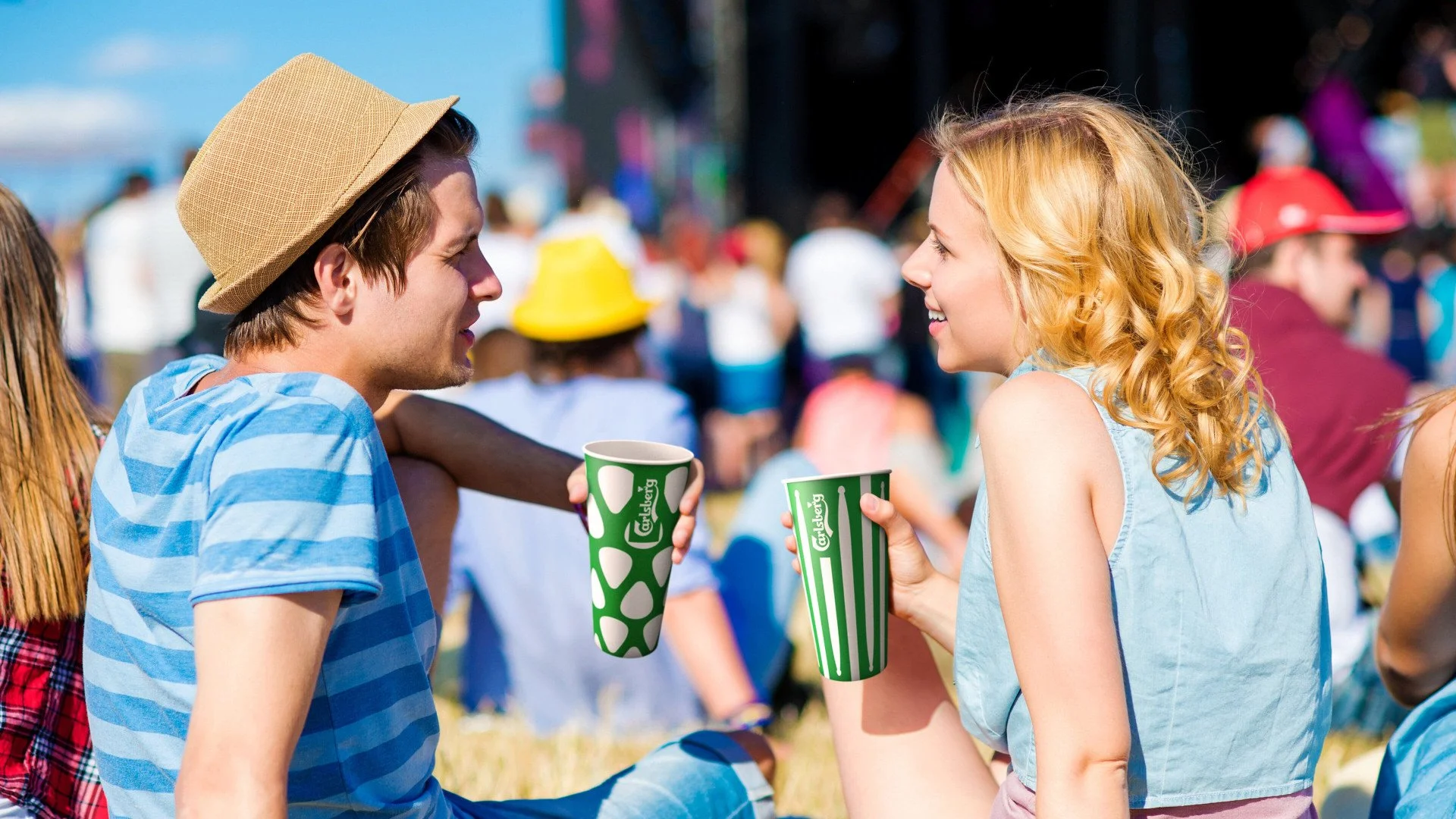
Festival:
This distinctive green and white patterning, synonymous with Carlsberg, then took on a life of its own and became a festival headliner. People loved it so much that the København Collection became the longest-running limited-edition design in the history of Carlsberg
The Results:
6% sales increase
475,000 paper cups distributed across UK festivals
100% recyclable cups
Awards:
Awards: Brand Impact Awards – Winner
Beer, Wine & Spirits, Brand Impact Awards – Winner
FMCG, Creative Review Annual – Best in Book
Packaging Design, D&AD – Wood Pencil
Illustration for Design, The Dieline Awards – Bronze
Packaging Design, Fab Awards – Silver
Packaging Design, Mobius – Silver
Illustration for Packaging, Pentawards – Silver
Limited Edition Beverages, Roses – Gold
Packaging Design, Roses – Bronze