
Nutrilon
A lens into nature
The Challenge
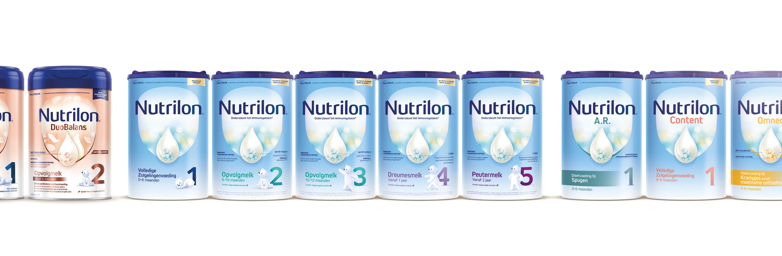
Our brief was to retain Nutrilon’s authority but to reframe its scientific excellence in a more natural way, and create a range architecture with clear navigation across age stages, functional and premium sub-ranges, and a dynamic innovation pipeline.
The Solution
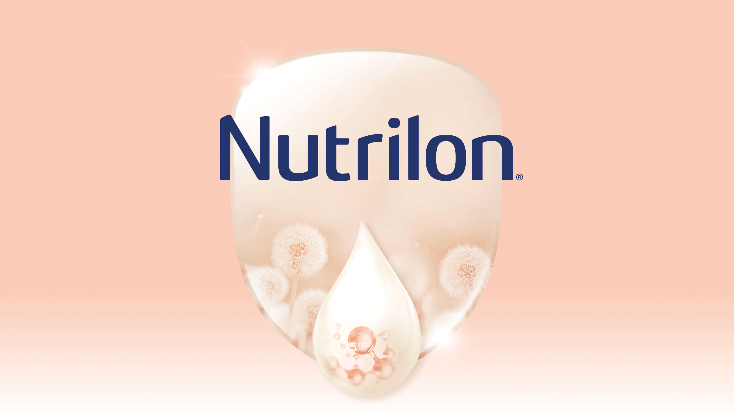
A new brandmark, refined typography, and a clean, calm, sophisticated pack architecture. The pack concept centers around Nutrilon’s iconic shield, softening its edges for a more natural, organic feel, we used the shield as a lens into nature and a holding device for the brandmark and droplet. The texture within the shield was inspired by dappled sunlight and the wonder of a baby’s first look at the world.
Info
Client: Danone Nutrilon
Designed: April 2021
Agency: Osborne Pike
My Role: Creative concepts and design development
Deliverables: Packaging Design